We have already created a very simple and basic report. For more details look at the Internal links listed below. And now we are going to make our report look better.
And the simplest way to have the reports to have standard look and layout is "to set AutoDesign's several properties"
AutoDesign has a property called Layout template, and
DataRegion (CustTable) has a property called Style template.
By modifying these two properties we can actually have a better look and feel for our report.
Layout Template:
This can be found under properties for AutoDesign node. When I click the comboBox to see the options avaliable for LayoutTemplate, I see the below and I choose "ReportLayoutStyleTemplateNoCompany".

Lets see what changes does it make to my report.
The report looks much better now. The Header and the Footer of the template have been automatically designed to somewhat similar to standard Ax reports.
Style Template:
This can be found under properties for the DataRegion node (CustTable in this case). And when I click the comboBox to see the options avaliable for StyleTemplate, I see the below options and I choose "TableStyleAlternatingRowsTemplate"
Lets see what changes does it make to my report.
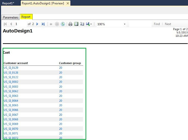
The report looks even better now. The data grid which was not formatted in the above screenshot, looks much better now and very well readable.
Remember, the templates which we used will mostly make changes to the Font of the text in the report, also text colours.. but doesn't manage the column widths, we will see how it is done in the next posts.
And so this is how we can design the reports which we create using the built-in templates. Good luck!
And the simplest way to have the reports to have standard look and layout is "to set AutoDesign's several properties"
AutoDesign has a property called Layout template, and
DataRegion (CustTable) has a property called Style template.
By modifying these two properties we can actually have a better look and feel for our report.
Layout Template:
This can be found under properties for AutoDesign node. When I click the comboBox to see the options avaliable for LayoutTemplate, I see the below and I choose "ReportLayoutStyleTemplateNoCompany".

Lets see what changes does it make to my report.
The report looks much better now. The Header and the Footer of the template have been automatically designed to somewhat similar to standard Ax reports.
Style Template:
This can be found under properties for the DataRegion node (CustTable in this case). And when I click the comboBox to see the options avaliable for StyleTemplate, I see the below options and I choose "TableStyleAlternatingRowsTemplate"
Lets see what changes does it make to my report.
The report looks even better now. The data grid which was not formatted in the above screenshot, looks much better now and very well readable.
Remember, the templates which we used will mostly make changes to the Font of the text in the report, also text colours.. but doesn't manage the column widths, we will see how it is done in the next posts.
And so this is how we can design the reports which we create using the built-in templates. Good luck!


No comments:
Post a Comment